EVENBUYER STORE - JIANGJIE DESIGN ©Wang Minjie
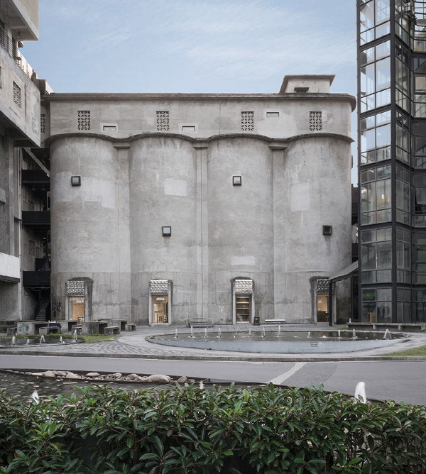
The site of the project is the clinker storage area of the original Shuangliu cement plant. Four huge cylinder structures are arranged in one line to form the main body of the building, and the internal interconnection is connected. The brand new storefront of buyer brand Evan buyer is here to use the language of architecture and design to describe its own style label and fashion attitude. Due to the special architectural properties, the storefront space area is large and long strip, while the product category and quantity of buyer's shop are various.

EVENBUYER STORE - JIANGJIE DESIGN ©Wang Minjie

EVENBUYER STORE - JIANGJIE DESIGN ©Wang Minjie
The designer makes use of the original door opening of the facade, and uses one as the main entrance of the store, while the other three become the floor window. Four small windows of high-rise buildings should form a common rhythm. Floor to ceiling windows provide plenty of natural light and are also used as windows to display the seasonal recommendations of the store. The flat screen of window stickers is in contrast with the products. The unified stainless steel corrugated board floating eaves is in contrast to the original cement texture of the building, which first brings visual impact to the arriving visitors and makes curiosity attract people into the store. Based on the original building structure, the office area is parallel to the entrance of the store. The designer disposes floating circular arc-shaped laminates at the entrance. The interior is a functional block which takes into account the fitting room / live room. The material is made of light-emitting film on the top surface and a complete mirror reflection.

EVENBUYER STORE - JIANGJIE DESIGN ©Wang Minjie

EVENBUYER STORE - JIANGJIE DESIGN ©Wang Minjie
The same dialogue continues throughout the space. Enter the clothing / Footwear display area on the left, and the space makes the product the main character. The floor type clothes hanger is placed in a more casual and loose way with the exhibition stand. Between the two cylinders on the left, a huge stair crossing stand divides the space and establishes a new connection. The height difference of the staircase platform blocks part of the customer's sight, stimulates more curiosity and exploration desire, and drains the cold area farthest from the entrance. The rich visual feeling formed by the high and low staggering also ensures the sense of hierarchy and interest of the space on the long-distance moving line. A large area of mirror is added to the booth to cover the fire hydrant and meet the fitting needs and extend the space. When people walk on the exhibition stand, it will unlock a new perspective of the observation space.

EVENBUYER STORE - JIANGJIE DESIGN ©Wang Minjie

EVENBUYER STORE - JIANGJIE DESIGN ©Wang Minjie

EVENBUYER STORE - JIANGJIE DESIGN ©Wang Minjie
The dialogue between delicacy and coarseness, contemporary texture and original texture. After removing the painting surface layer, the original wall of the building presents the original blank state, and the unique texture is the imprint of the times. In this context, stainless steel and mirror materials inject strong contrast. After entering the store, the bar area is on the right. The designer uses the simplest stainless steel square block to divide the space into two and separate the passageway leading to the bathroom. In the hands of designers, round and square, rough and delicate, original texture and modern materials, minimalist design language and current fashion items all constitute interesting intertextuality and response to "meaning", and finally converge into this relaxed and rhythmic space.
리듬을 형성한 공간 , EVENBUYER STORE
- 최윤선 기자
- 2021-07-24 22:59:37
- 조회수 482
- 댓글 0
최윤선
저작권자 ⓒ Deco Journal 무단전재 및 재배포 금지


0개의 댓글
댓글 정렬